BEN SPENCER analyses the good news graphs the experts didn’t show you 

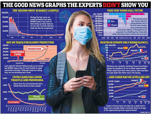
Four times yesterday we were told that Covid numbers are going in the wrong direction. Cases are up, hospital admissions are up and deaths are up, the grim press conference informed the nation. Sir Patrick Vallance, the Government’s chief scientific adviser, warned: ‘This is headed in the wrong direction. There’s no cause for complacency here … Read more

Are the government’s ‘scary’ graphs as bad as they seem?

Graphs of coronavirus data presented to the public by chief scientists Sir Patrick Vallance and Professor Chris Whitty today may not be as scary as they were made out to be, according to experts. The chief scientific adviser and chief medical officer for England this morning warned that Britain is heading for a surge in … Read more

Stunning new graphs show how coronavirus is still surging in many US ciites

Shocking new graphics show that the novel coronavirus is still surging in several counties across the US. As states begin to reopen their economies, several cities have been seeing their daily COVID-19 infections increase. Daily infections in Harrison, Texas – a state that has been aggressively reopening – have spiked by 900 percent since mid-April. … Read more

Coronavirus US: Graphs show lockdown may need to last til July

New graphs suggest social distancing measures may need to continue through the summer in many states to prevent a resurgence of the novel coronavirus.   Researchers found that fewer options for control later and a higher likelihood of exceeding hospital capacity would occur if measures were relaxed in May or earlier like many governors have done. … Read more

Graphs show how mental health of every US generation has suffered amid the coronavirus pandemic 

Graphs reveal nearly 40% of baby boomers feel anxious and depressed amid the pandemic while more than half of millennials want to talk to a therapist to help them cope with coronavirus All generations, including Generation Z, Millennials, Generation X, Baby Boomers and the Silent Generation reported worsening mental health More than half of Millennials … Read more

Stunning graphs predict when coronavirus deaths will peak in every state

Stunning graphs have revealed when the novel coronavirus is projected to peak in every US state.  Researchers from the University of Washington’s Institute for Health Metrics created a model showing when deaths and hospital resource use is estimated to reach their heights from coast to coast. The model shows that New York is projected to … Read more

Graphs lay bare how US coronavirus cases have overtaken Italy

The United States now has the world’s biggest and fastest growing coronavirus outbreak with more than 92,000 confirmed cases across the country..  America is now recording more new coronavirus cases per day than anywhere else in the world, although Italy has a higher fatality rate. Italy has recorded the second most total coronavirus cases at 86,498 – … Read more

Graphs lay bare how US coronavirus cases have overtaken Italy

The United States now has the world’s biggest and fastest growing coronavirus outbreak with more than 92,000 confirmed cases in America.  America is now recording more new coronavirus cases per day than anywhere else in the world, although Italy has a higher fatality rate. Italy has recorded the second most total coronavirus cases at 86,498 – 9,134 … Read more